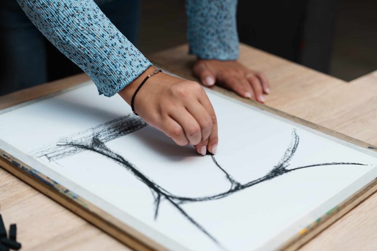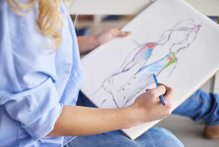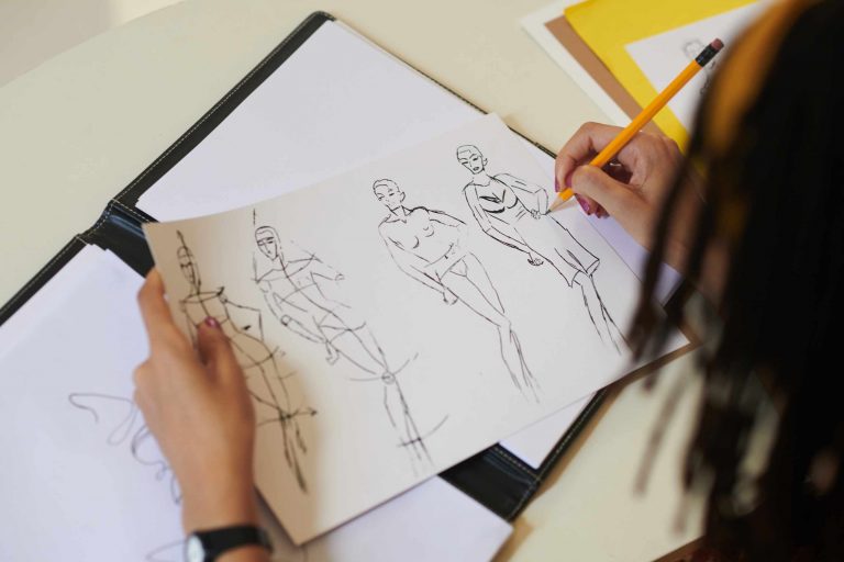
Why might a sketch of a mug have the right shape for its handle, rim, and shading, but still look a bit off? Usually, something went wrong way back at the beginning when the overall width and height of the mug were established on the paper. It is nearly impossible to fix a body that is too thin, a handle placed too high, or a neck that consumes too much or too little of the whole form with details. Establishing the correct proportion before refining is an opportunity to catch and correct these mistakes before they compound.
Begin by selecting one simple subject to draw and take a quick proportion study before drawing your contour carefully. Start by marking the approximate top, bottom, left, and right limits with light construction lines. Next, compare the overall height and width and divide the form into a few large divisions. For example, on a bottle consider what portion of the overall height is taken up by the body, shoulder, and neck. With a mug consider what portion of the form is taken up by the body vs. the handle. Keep the study loose; you are making measurements here, not a finished drawing.
You don’t need precise measurements to make useful comparisons. Instead think in terms of ratios. Is the subject about twice as tall as it is wide? Or only a little bit taller? Does the handle begin at a point above or below the midpoint? Is the top ellipse significantly narrower than the body? You can also compare the lengths of various visible distances against each other by extending your pencil at arm’s length and marking off a length with your thumb. It is the consistency of the viewing distance during comparison that matters most, rather than an accurate measurement per se.
Negative space offers another useful tool for checking proportions. Consider the negative space adjacent to the handle, underneath a tilted object, or between two objects that overlap. If that area appears much wider, narrower, taller, or more triangular in your drawing than in the reference, it may be that one of the nearby objects needs to be adjusted. Sometimes, this reveals a proportion error that is difficult to spot when looking at just the object itself. Similar checks can be done with alignments. Consider how the major corners, center points of ellipses, and edges relate to one another.
It is easy to get distracted with detail, but once you have invested time in drawing a label, a seam, a texture, or some shading, you may find yourself reluctant to revise any of the larger elements that don’t quite fit because it would require undoing all of that work. Leave the early phase simple enough that modifying an edge, reducing the size of a box, or moving an ellipse would hardly cost anything. Using a graphite pencil with very light pressure allows multiple potential construction lines to exist on the page without overwhelming the composition.
When you are satisfied that the broad relationships are correct, only reinforce the contours that correspond to the underlying structure. Add line weights, overlaps, simple value differentiation, and selective detail. Should anything still feel “off,” try ignoring the surface information and returning to checking the largest measurements. Overall width to height, locations of the main divisions, angle, and negative space are all helpful to check even on more advanced sketches.
On your next object study, hold off on all decorative detail until you are able to characterize your subject purely in terms of its extreme boundaries and a few large internal divisions. If the resulting simplified shape is close to the reference, you have created a stable structure for your more refined contours and values. If not, it will be much easier to adjust three light lines than to salvage a finished drawing.